
GUI for pilots in flight use
Spotlight Labs sells a product that can be inserted in fighter pilot helmets in order to monitor Spo2 levels and other biometric data. This device requires a straightforward GUI that the user can utilize to adjust settings, download recorded data, and view live data during the flight. I lead the redesign project to create a product that is easy to use in high stakes and stressful environments.
Role
UI Designer
Timeline
November - December 2024
Platform
Figma
Collaboration
2 Founders, 2 Developers, 1 Test Engineer
Objective
The original GUI design displayed strings of text with no hierarchy or organization. It was difficult to read prevented the users from quickly interpreting data as they work in the fast moving and high stakes environments of aircraft cockpits.
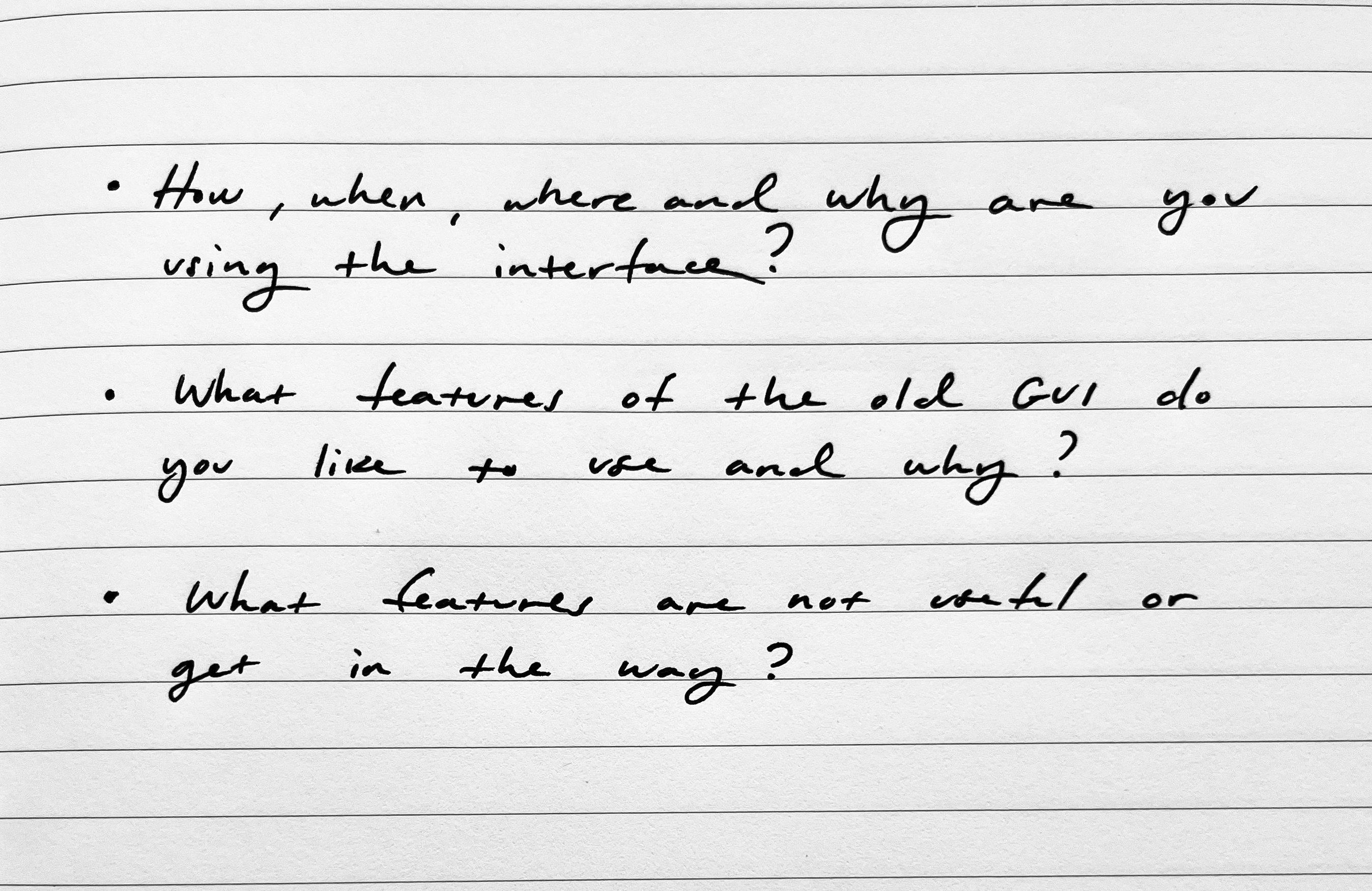
Research and process
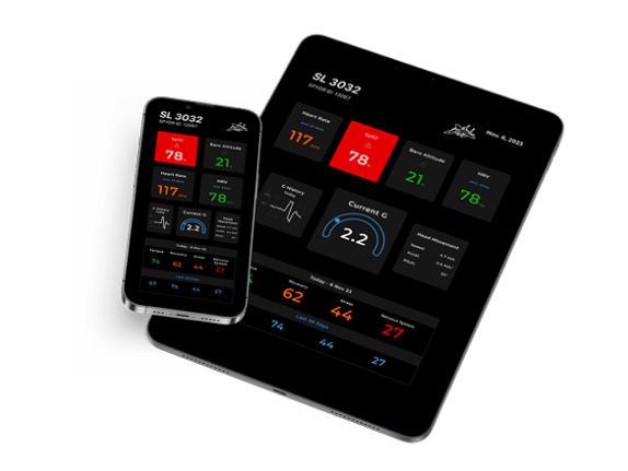
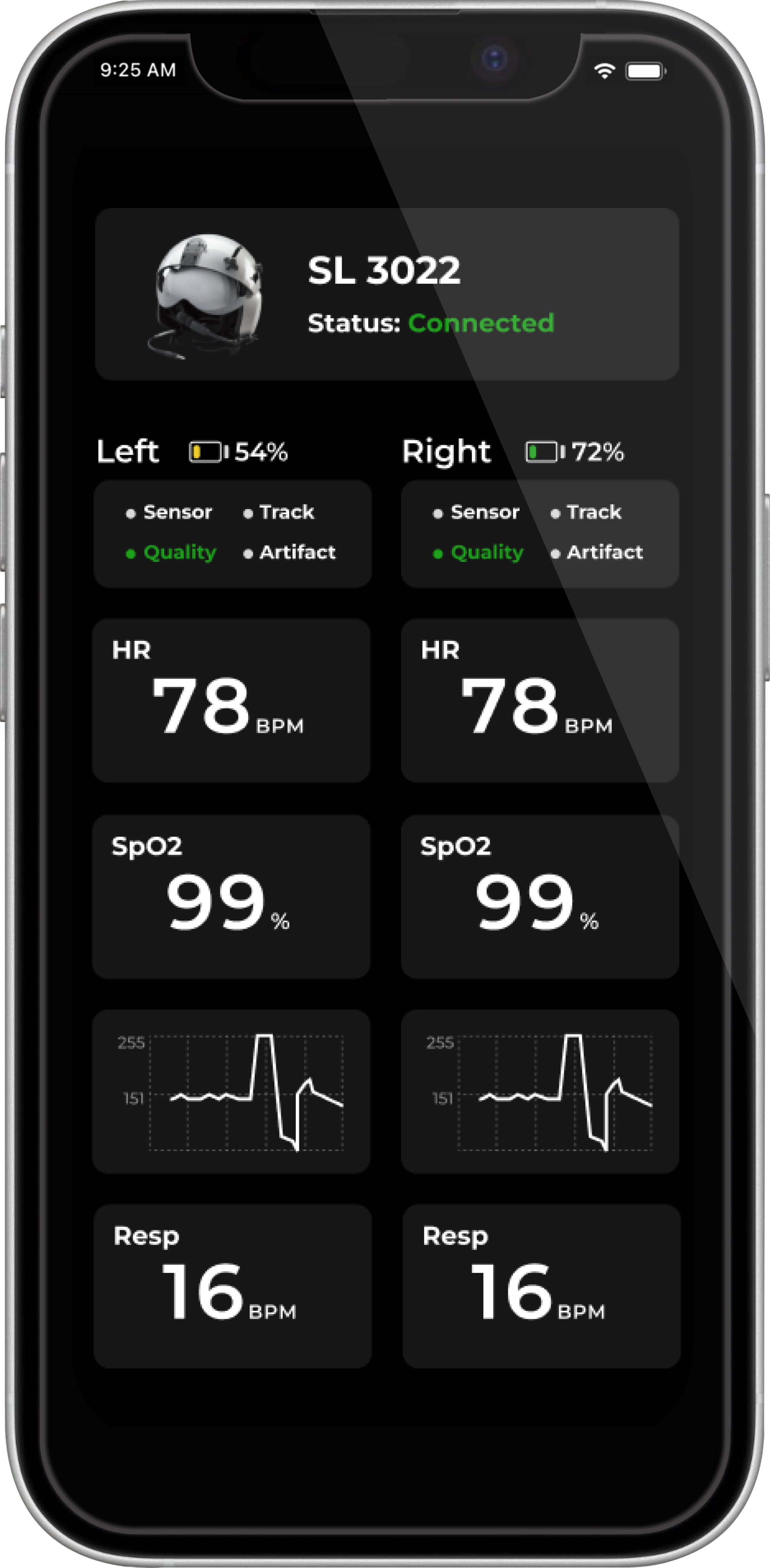
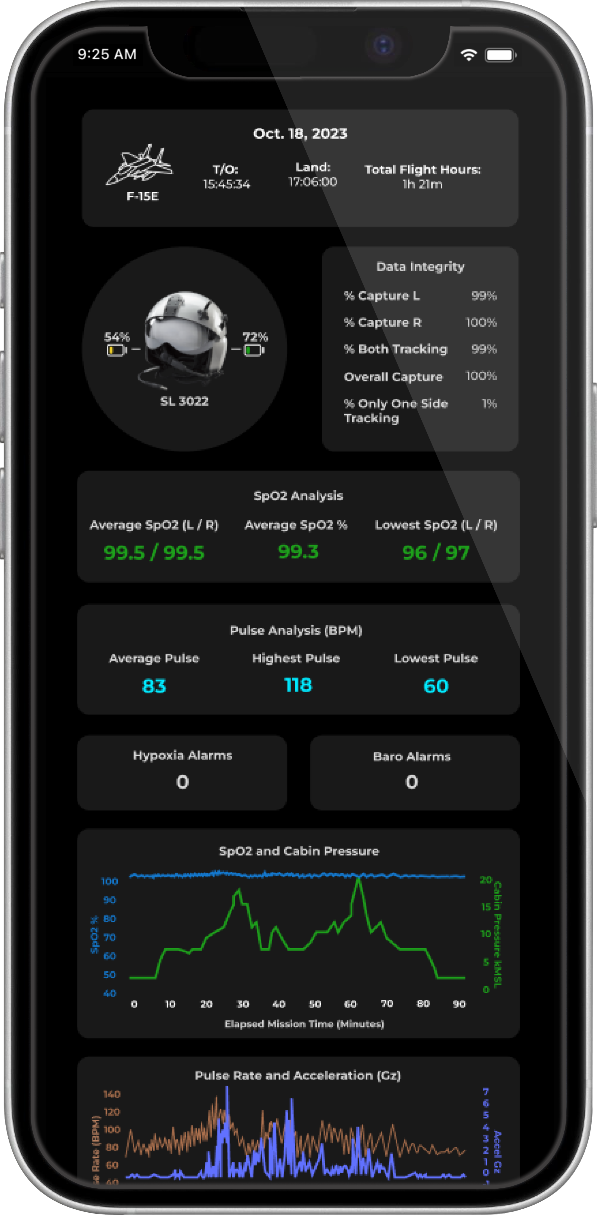
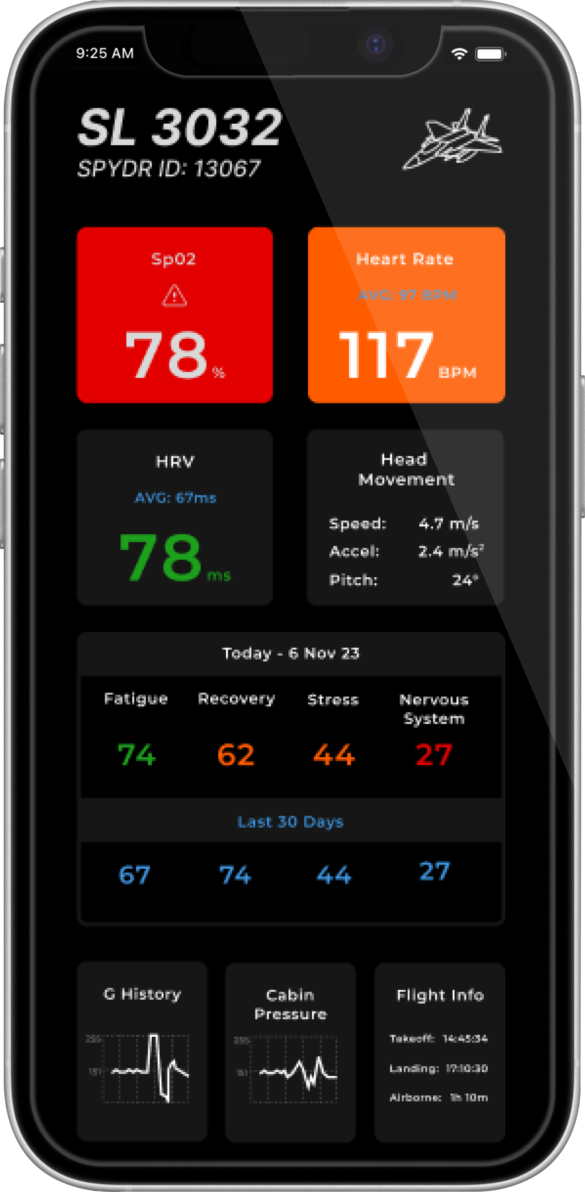
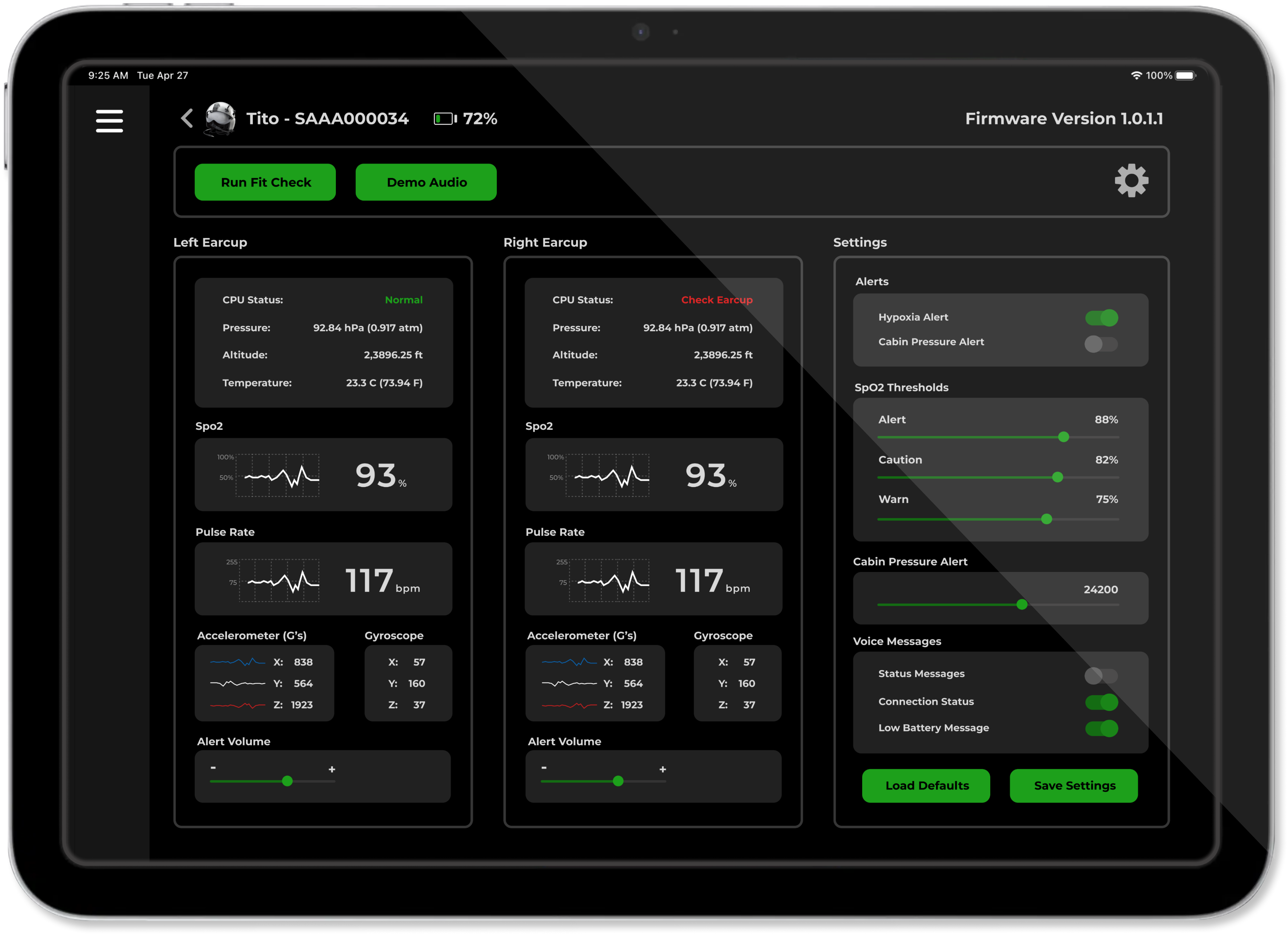
To begin the design process I met with the engineers that utilized the GUI the most. I discovered that the environment where they would be changing settings and downloading data would be in the locker rooms, and that the live data would be viewed separately by pilots in flight. Because of this, I kept the dashboard of live data separate from the settings, and presented the data with a large font size and color coded the data points to differentiate easily between them.
First design iteration
Goals

Create an interface that effectively communicates the data points at a glance, allowing numbers and data points to be perceived rapidly through graphs and color choices.
Design a layout that clearly defines the data by left and right earcup.
Display settings in an easily accessible location.
Final review and results
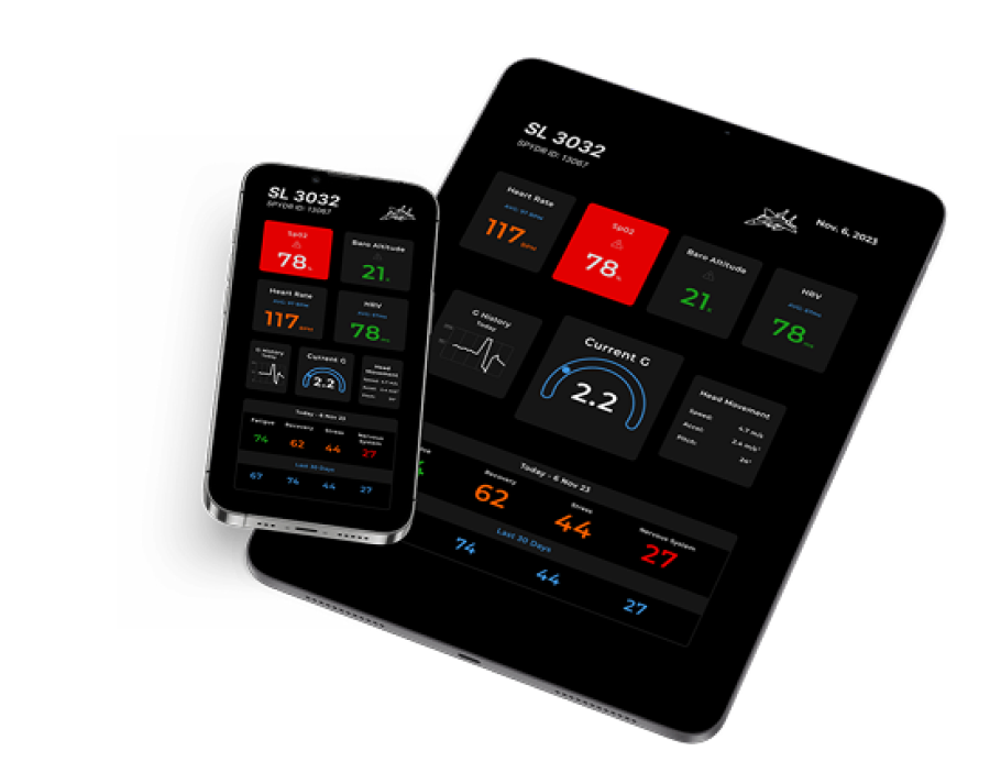
Data points
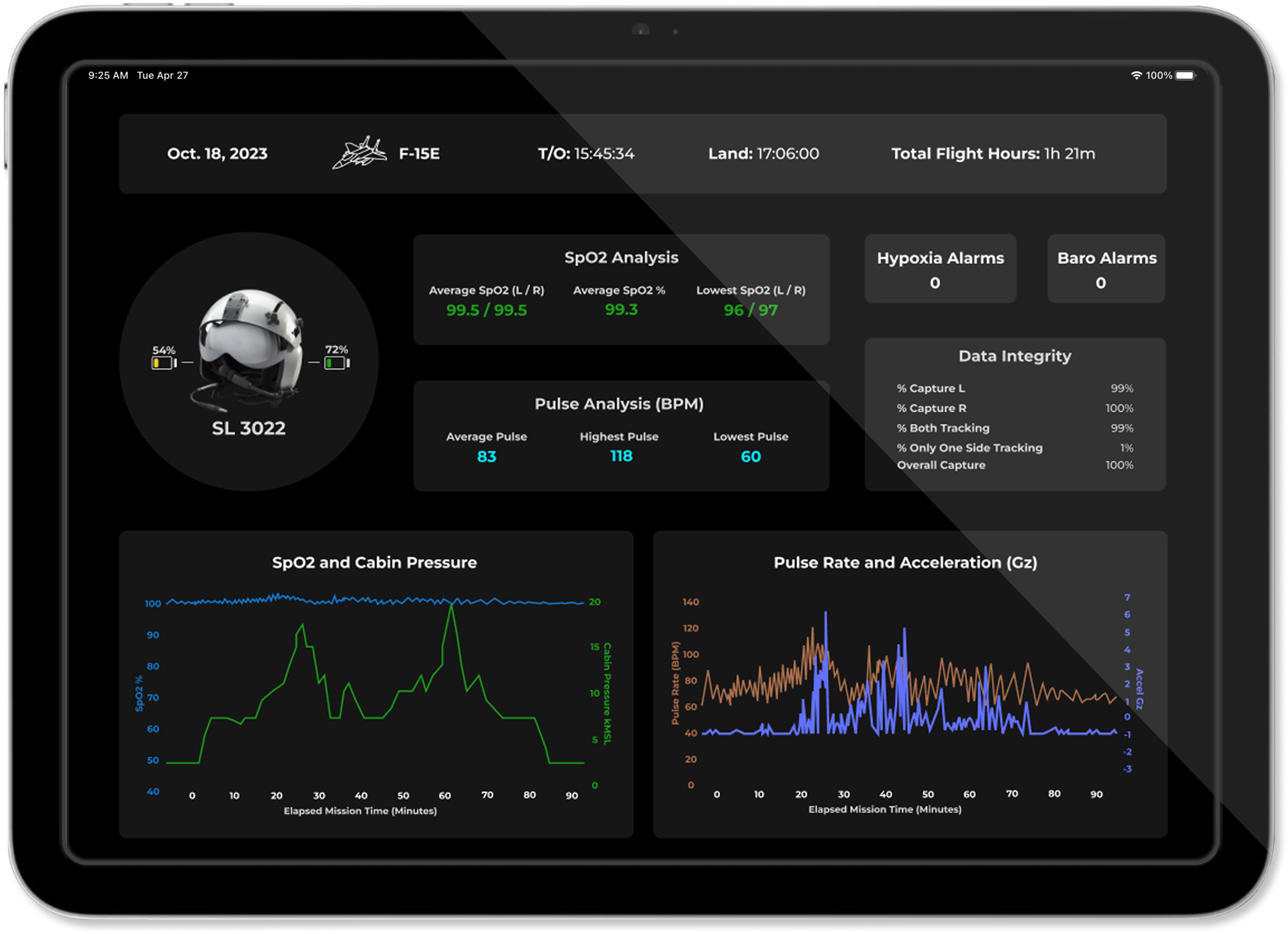
Selected two data points that the engineers deemed the most important, Sp02 and Pulse Rate, and created accompanying live graphs to allow for quicker interpretation of the data.
Feature accessibility
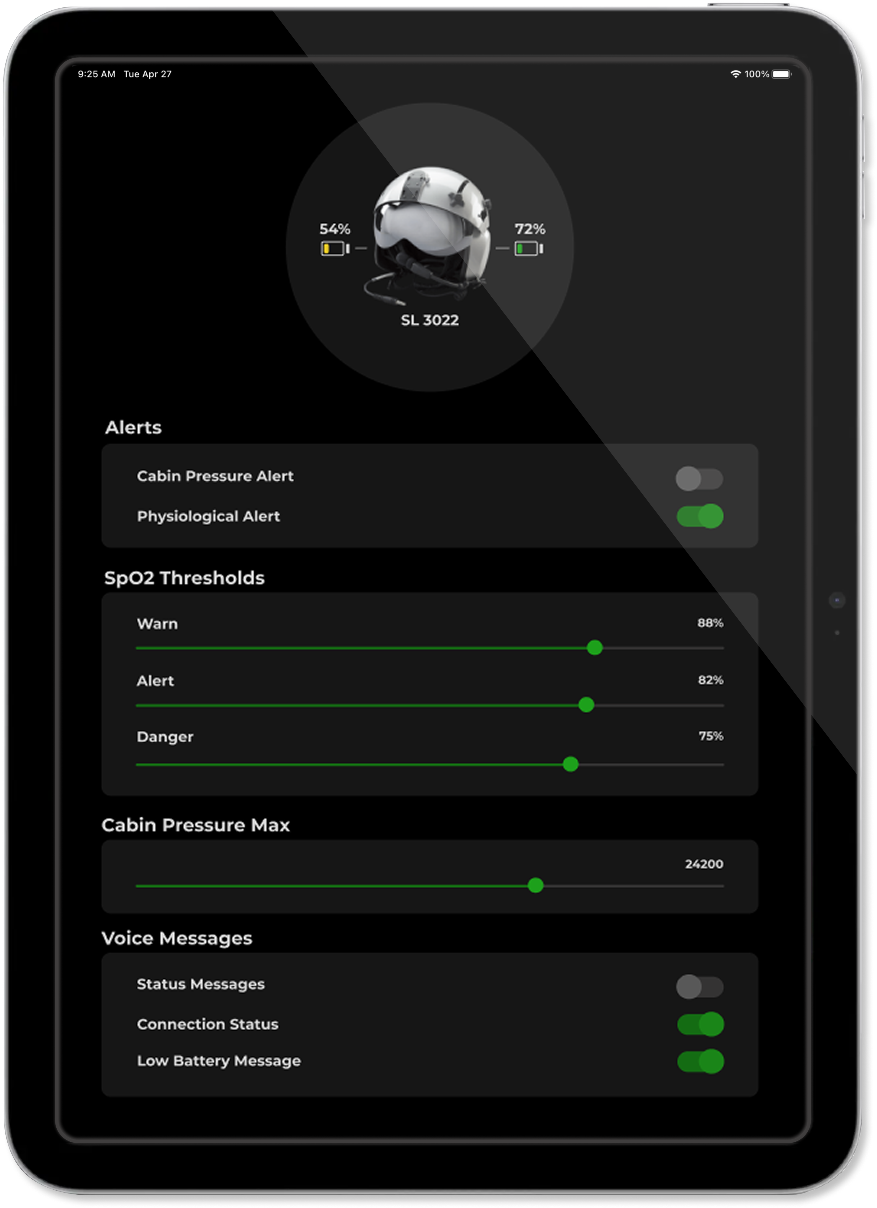
Separated the settings the users utilized the most, like volume and alerts, and displayed them on the home screen alongside the earcups so that they could be quickly assessed and changed.
Admin settings
Moved the file uploads and admin settings into a second page that is accessible through a settings menu button in the top right corner. This cleaned up the landing page and allowed for easier access.
GUI for pilots in flight use
Spotlight Labs sells a product that can be inserted in fighter pilot helmets in order to monitor Spo2 levels and other biometric data. This device requires a straightforward GUI that the user can utilize to adjust settings, download recorded data, and view live data during the flight. I lead the redesign project to create a product that is easy to use in high stakes and stressful environments.
Role
UI Designer
Timeline
November - December 2024
Platform
Figma
Collaboration
2 Founders, 2 Developers, 1 Test Engineer
Objective
The original GUI design displayed strings of text with no hierarchy or organization. It was difficult to read prevented the users from quickly interpreting data as they work in the fast moving and high stakes environments of aircraft cockpits.
Research and process
To begin the design process I met with the engineers that utilized the GUI the most. I discovered that the environment where they would be changing settings and downloading data would be in the locker rooms, and that the live data would be viewed separately by pilots in flight. Because of this, I kept the dashboard of live data separate from the settings, and presented the data with a large font size and color coded the data points to differentiate easily between them.
First design iteration
Goals
Create an interface that effectively communicates the data points at a glance, allowing numbers and data points to be perceived rapidly through graphs and color choices.
Design a layout that clearly defines the data by left and right earcup.
Display settings in an easily accessible location.
Final review and results
Data points
Selected two data points that the engineers deemed the most important, Sp02 and Pulse Rate, and created accompanying live graphs to allow for quicker interpretation of the data.
Feature accessibility
Separated the settings the users utilized the most, like volume and alerts, and displayed them on the home screen alongside the earcups so that they could be quickly assessed and changed.
Admin settings
Moved the file uploads and admin settings into a second page that is accessible through a settings menu button in the top right corner. This cleaned up the landing page and allowed for easier access.