
End-to-end app development
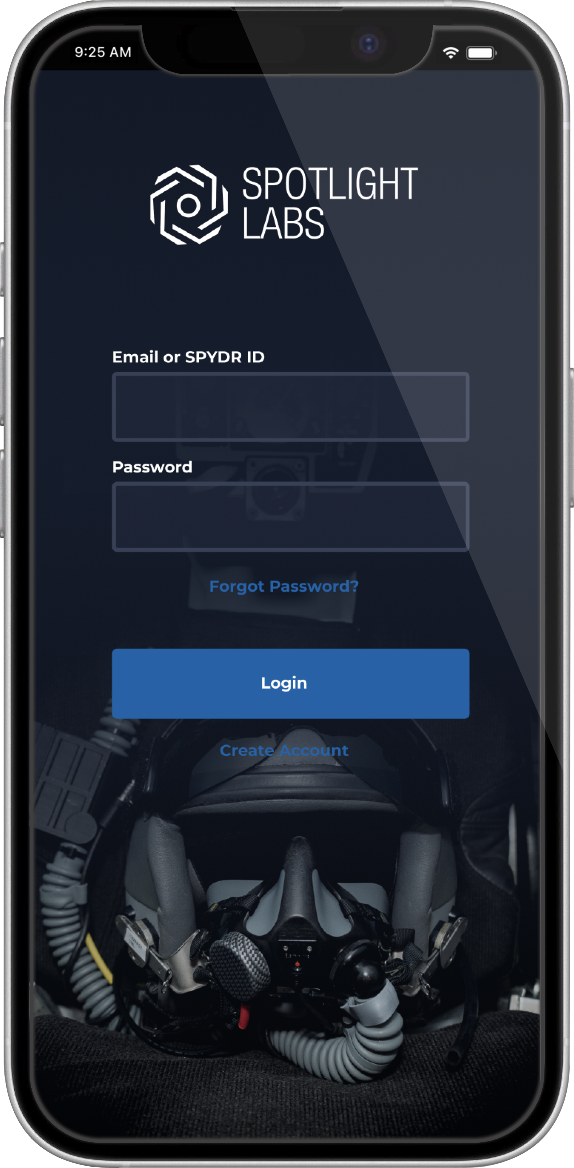
SPYDR WEB is a mobile application built for Air Force pilots that consolidates the users flight data along with their biometrics and cognitive assessments in one place. With SPYDR WEB, pilots can complete their preflight risk assessment from anywhere, and view this data alongside inflight data at the end of the day.
Role
Product Designer
Timeline
April 2022 - Ongoing
Platform
Figma
Collaboration
2 Founders, 6 Developers, 100+ Test Users
Problem
Before every flight, pilots are required to complete a risk assessment that up until now has only been available on paper and needs to be physically handed to their supervisor. This process is clunky, and there is no way to analyze the data for patterns.
Outcome
I designed user flows, wireframes, and mockups for iOS, Android and desktop platforms over the course of this project. I took feedback from active users to inform my design decisions and presented them to the development team to determine engineering capability, resulting in a functional product that is currently in use at multiple Air Force bases across the United States.
Research and planning
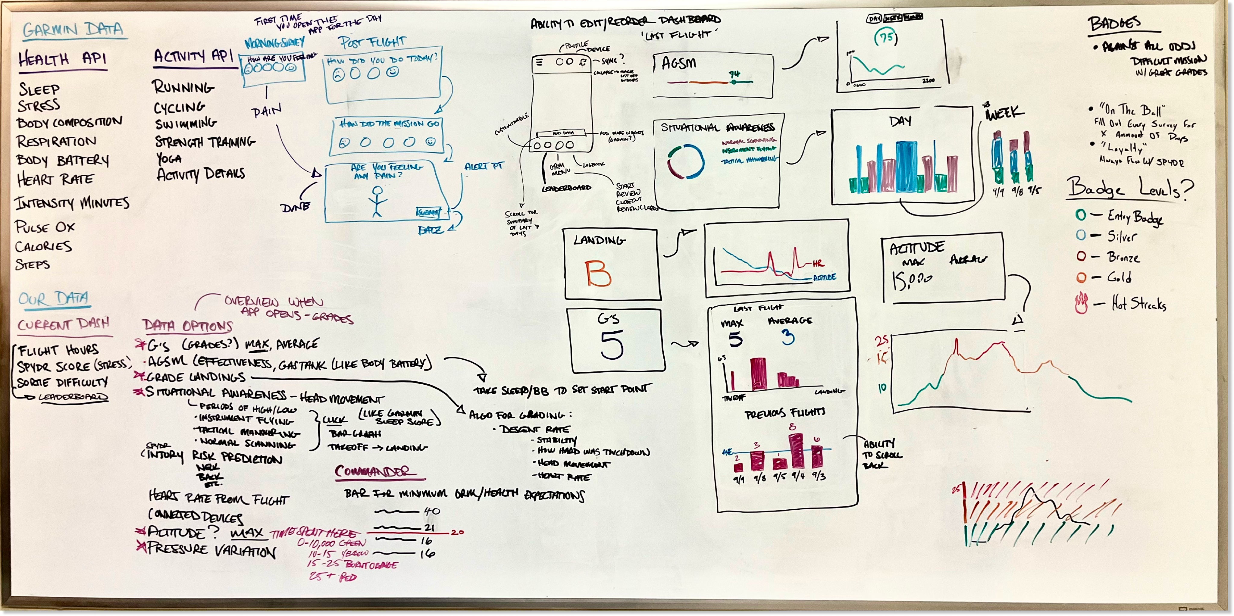
Our team worked together to collect data on what the pilots needed the most. We determined that an interactive form would be the best approach, and displaying the resulting data visually alongside the users biometric data from the flight would provide an easy way to notice patterns.
Colors

Typography
Montserrat
Montserrat
Montserrat
Illustrations
Goals
Expedite survey responses
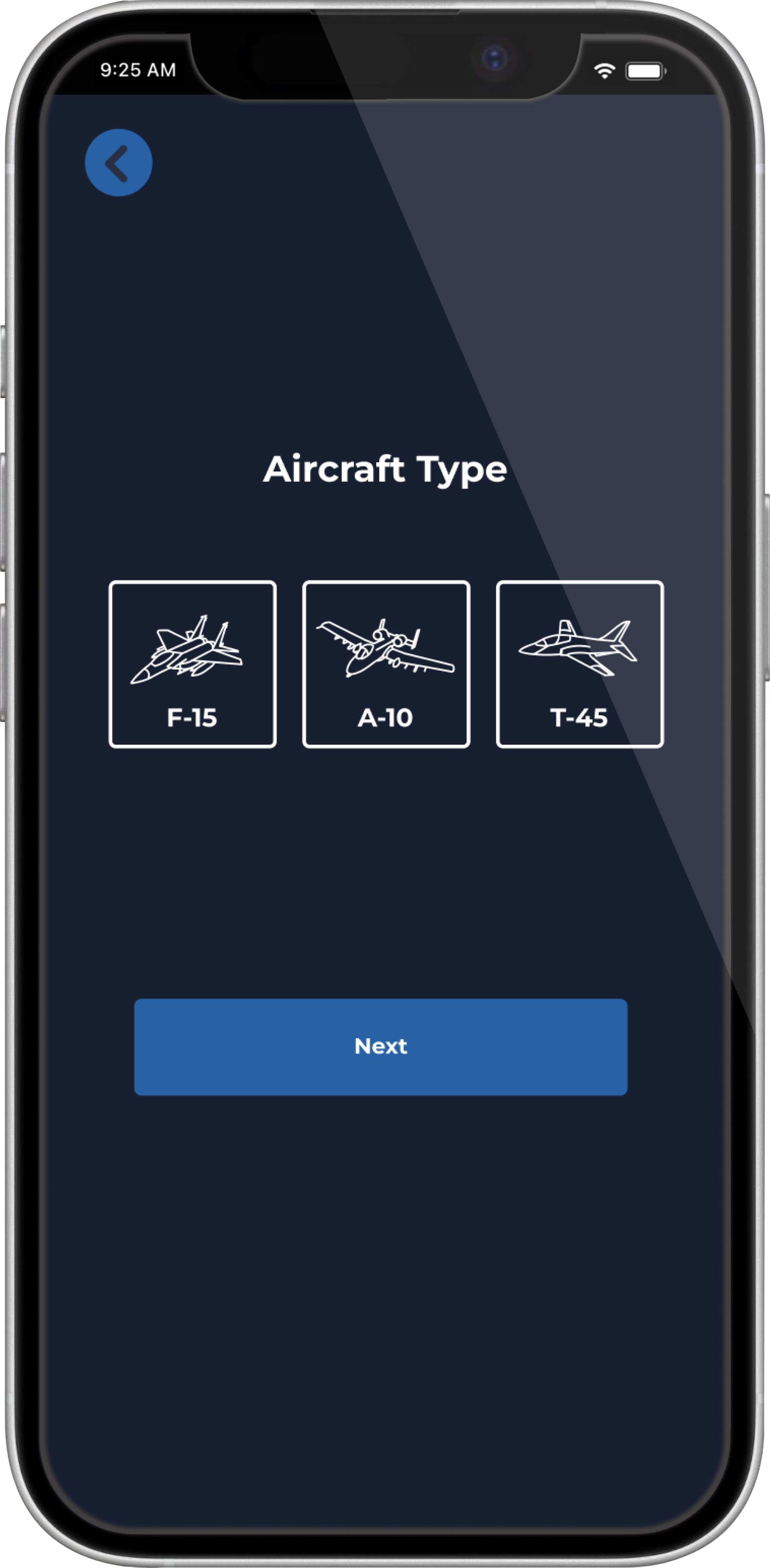
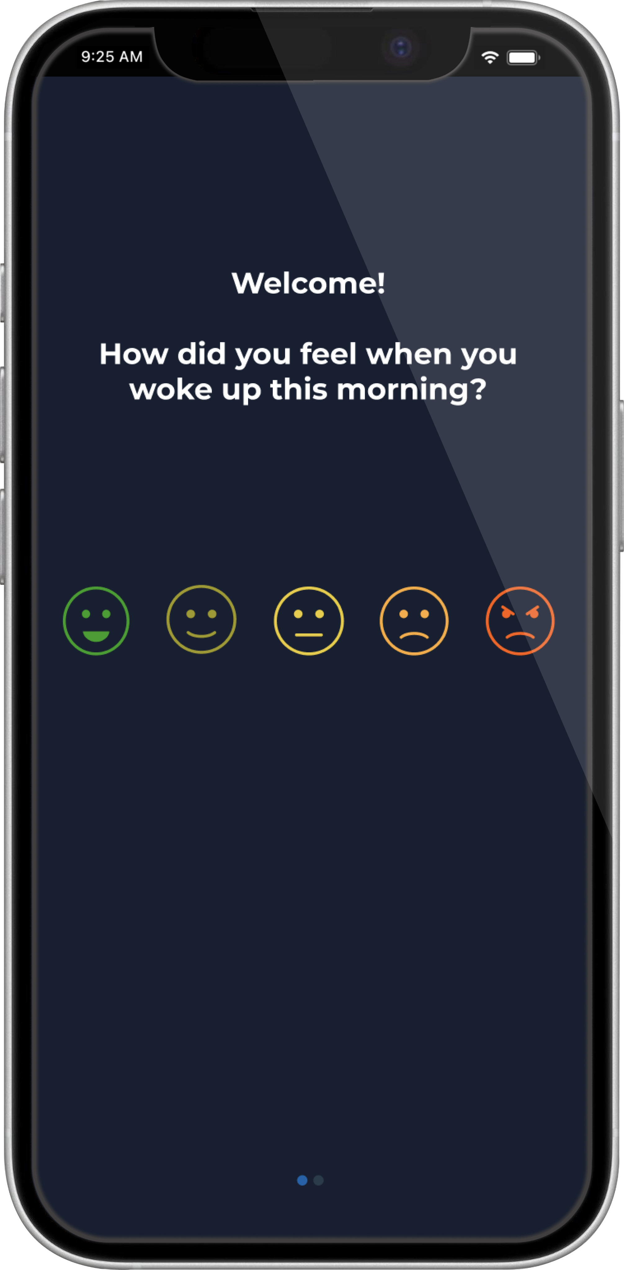
We created a risk assessment process with images and autofilled responses, making it easier for the pilots to complete than on pen and paper.
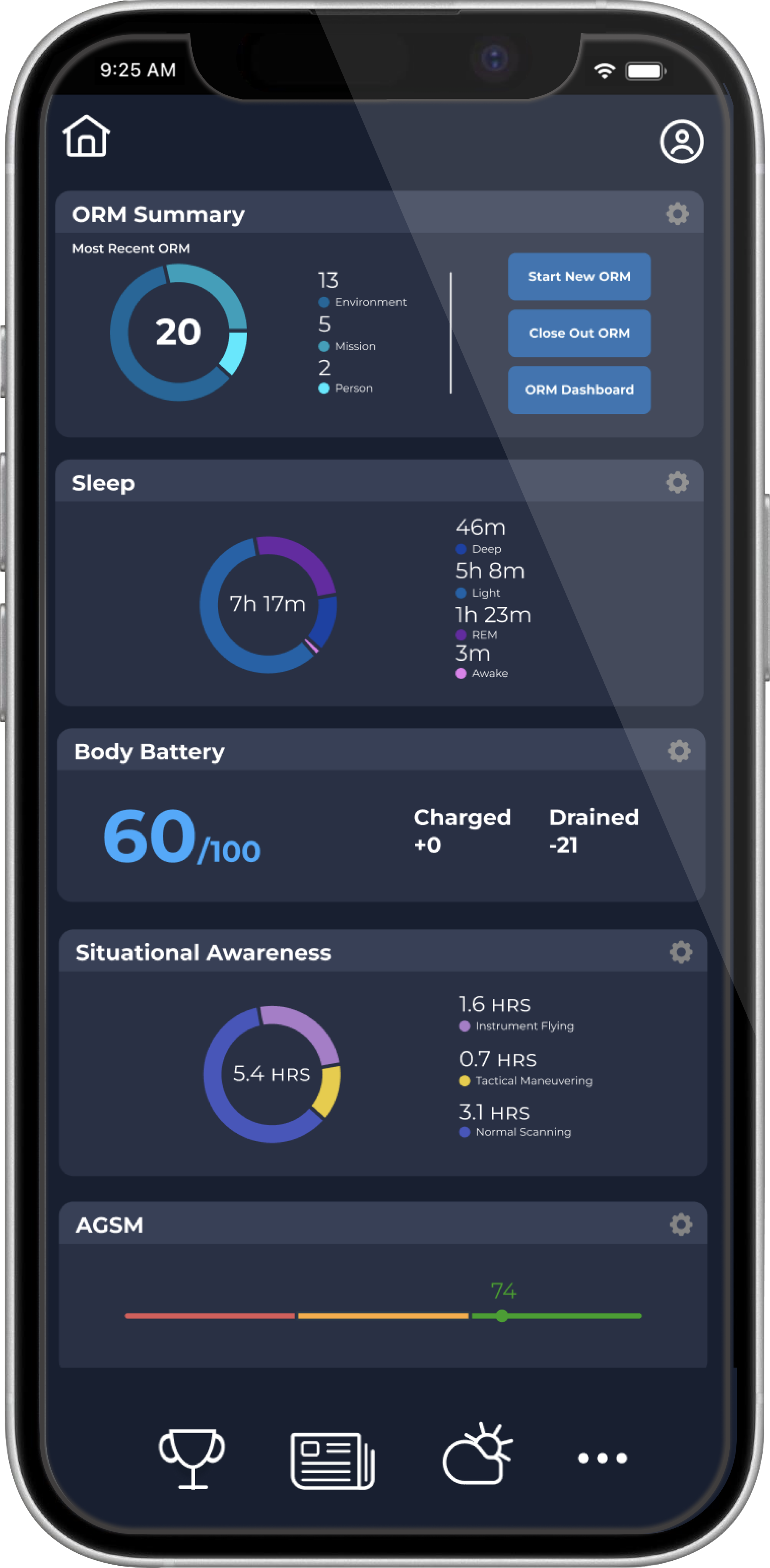
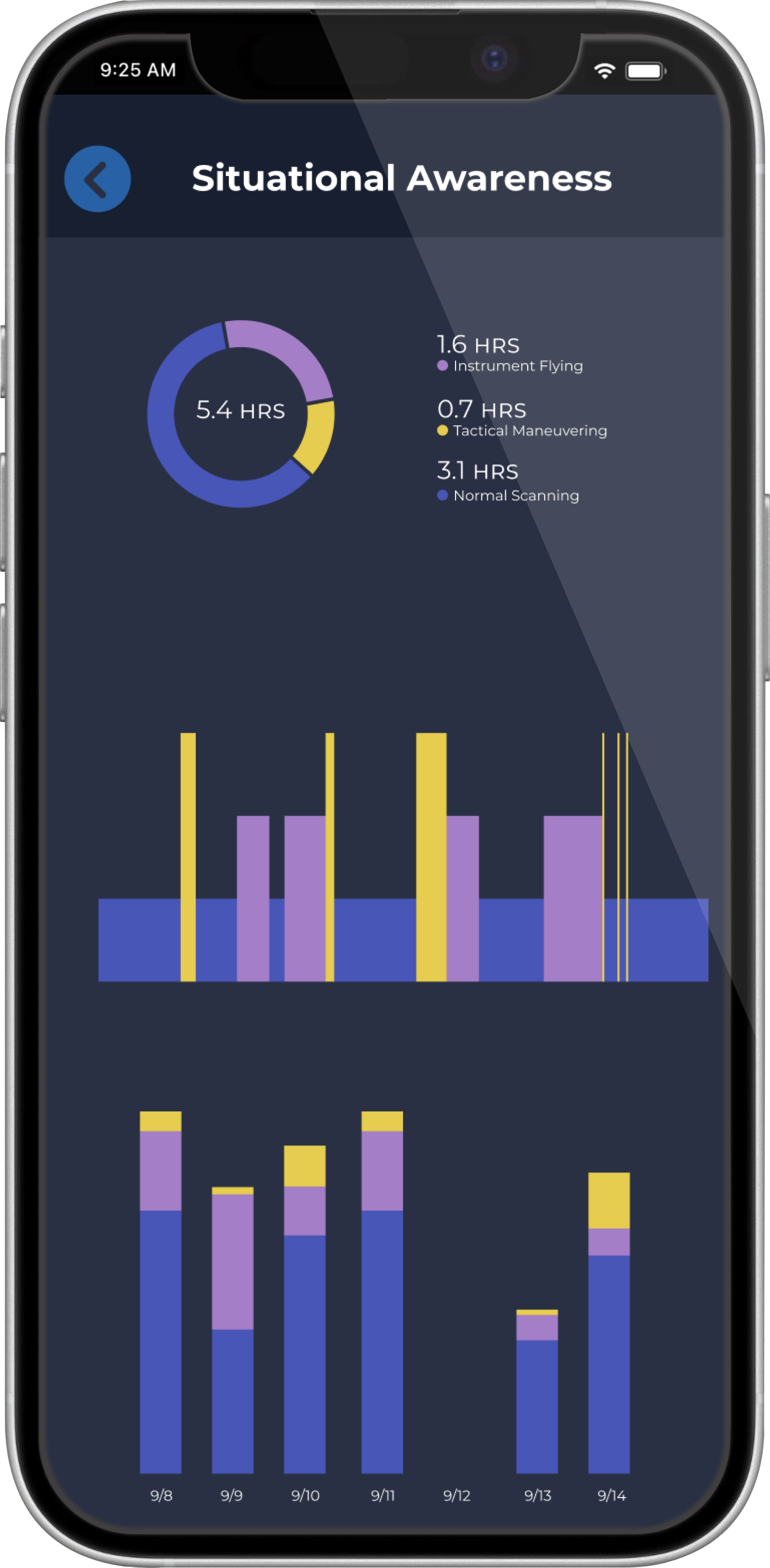
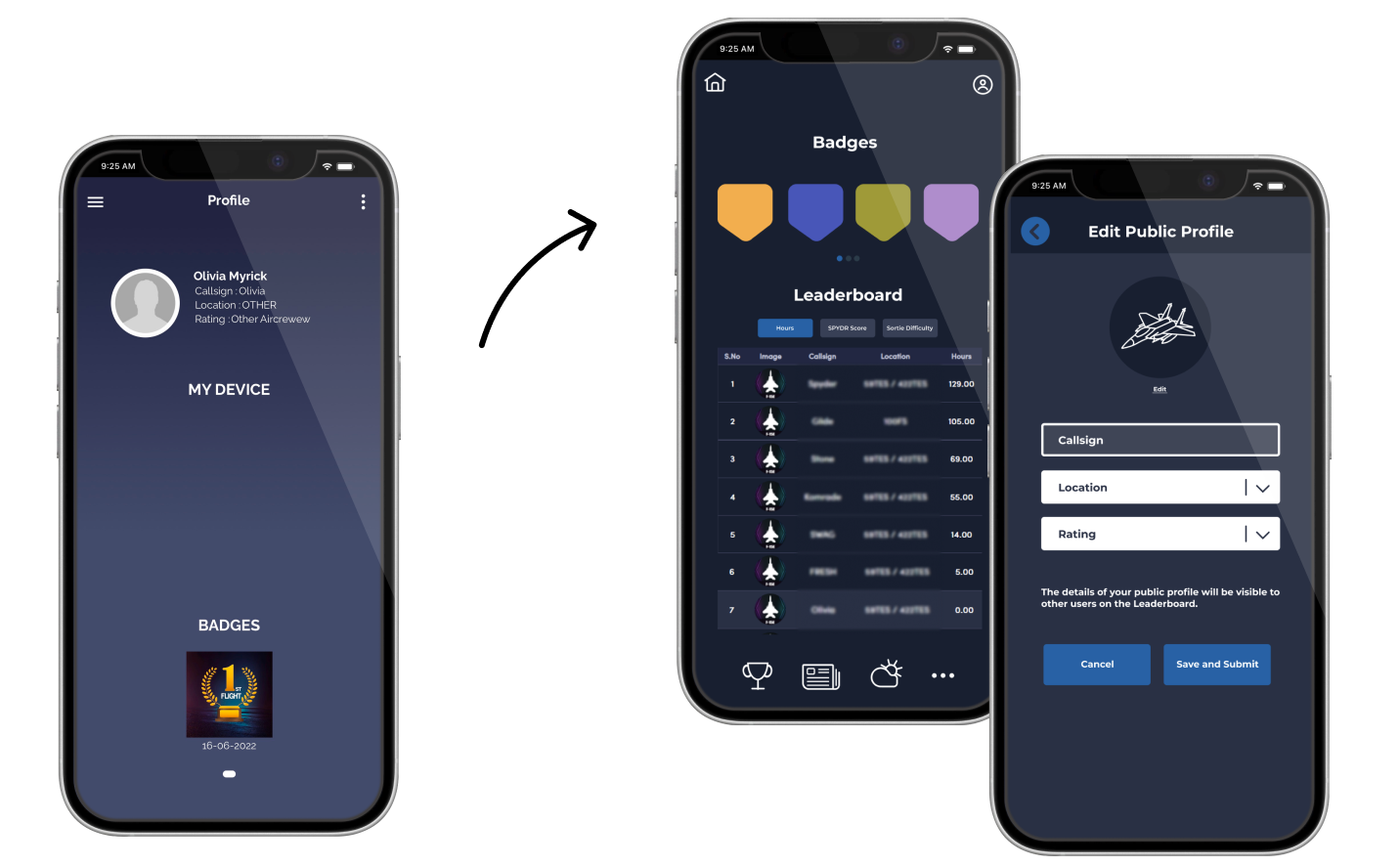
Consolidate data
We displayed clear visual charts and graphs of the users biometric data alongside preflight and post flight data, including personal Garmin watch data, creating one location to view all of the users relevant data.
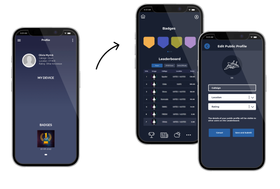
Increase engagement
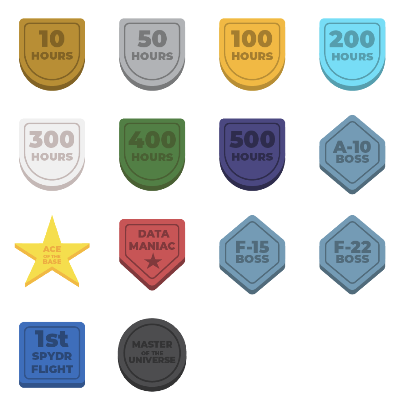
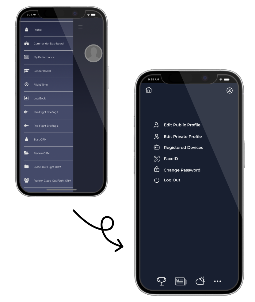
We gamified the process by allowing optional leaderboards with levels and badges. This encouraged friendly competition and kept users coming back and staying on the app longer.
Clean up the graphics
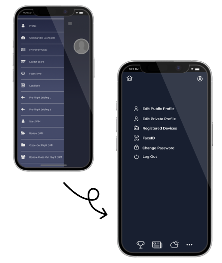
I redesigned the color palette and graphics to appear cleaner by removing gradients and simplifying the icons and illustrations
Feedback and adjustments
The pilots did not enjoy typing in answers or reading long lines of text for surveys, so we replaced these with images wherever possible. This created a more exciting and engaging experience while improving efficiency.
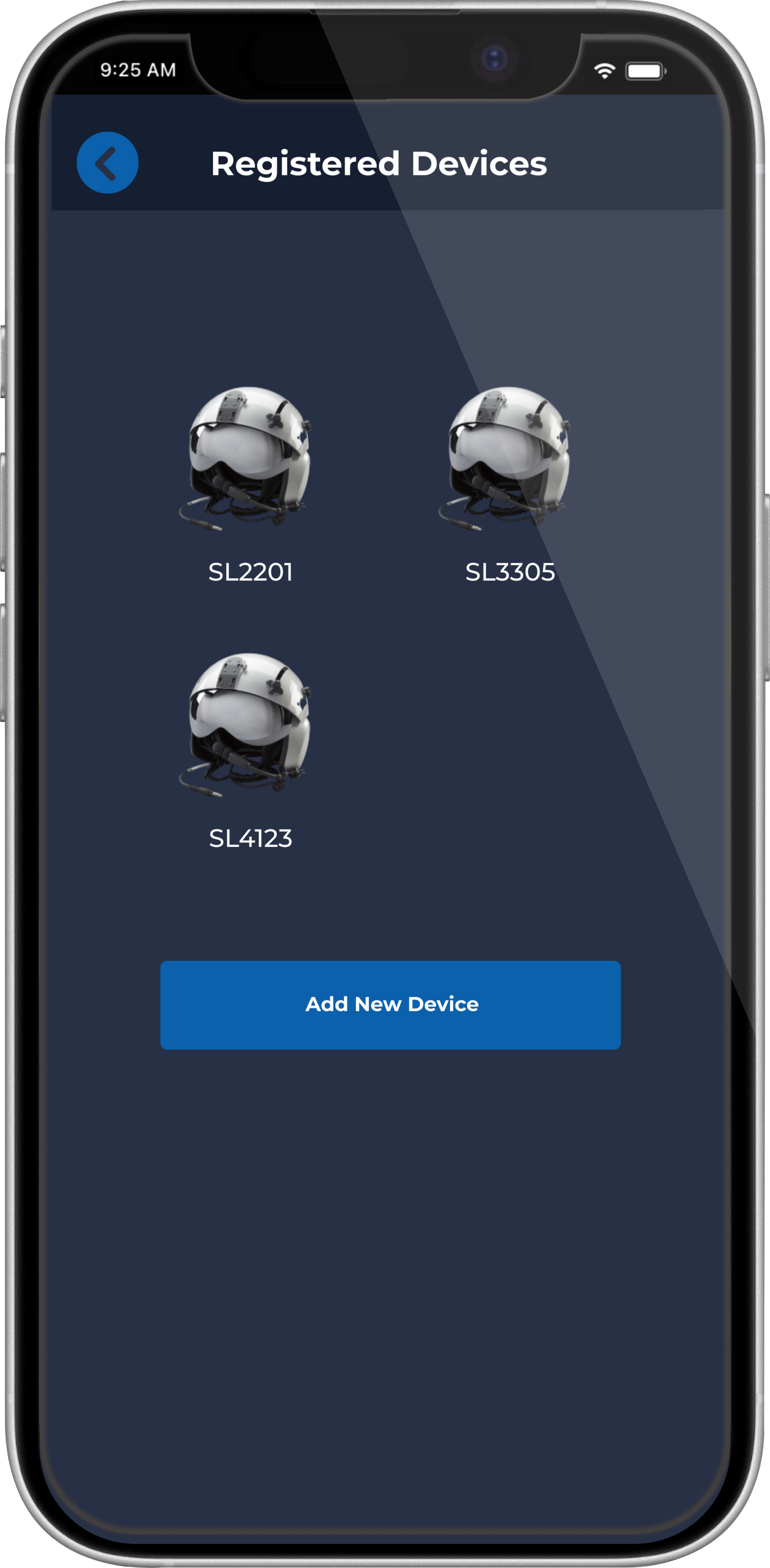
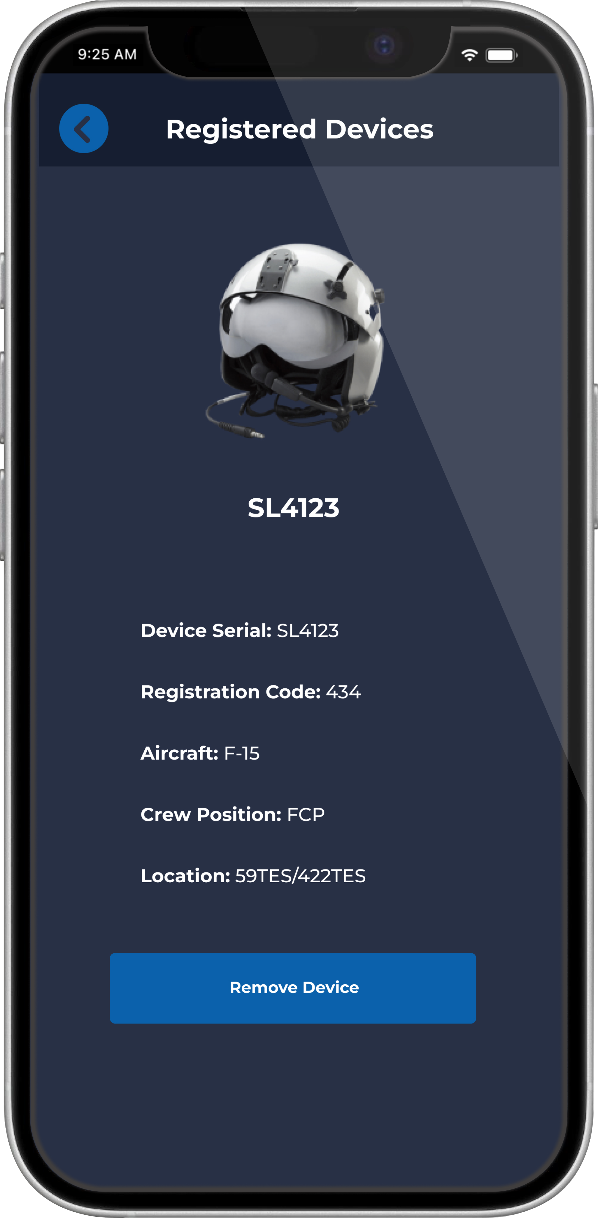
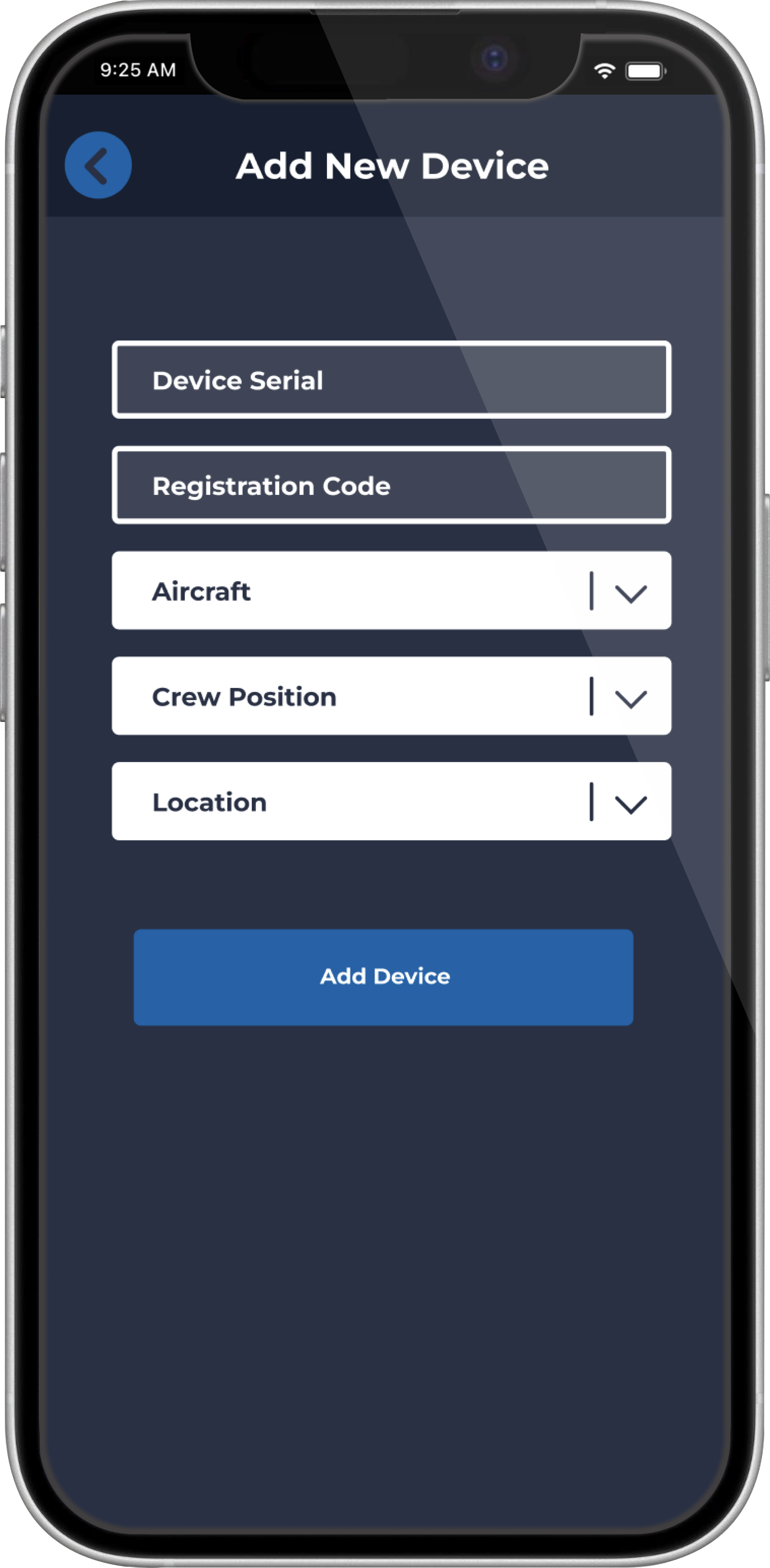
The ability for users to connect their own helmets was not originally a feature. Throughout testing we resolved dozens of issues related to this, as only admin held permissions to edit them. We added functionality devices on the front end and feedback from users was positive.
End-to-end app development
SPYDR WEB is a mobile application built for Air Force pilots that consolidates the users flight data along with their biometrics and cognitive assessments in one place. With SPYDR WEB, pilots can complete their preflight risk assessment from anywhere, and view this data alongside inflight data at the end of the day.
Role
Product Designer
Timeline
April 2022 - Ongoing
Platform
Figma
Collaboration
2 Founders, 6 Developers, 100+ Test Users
Problem
Before every flight, pilots are required to complete a risk assessment that up until now has only been available on paper and needs to be physically handed to their supervisor. This process is clunky, and there is no way to analyze the data for patterns.
Outcome
I designed user flows, wireframes, and mockups for iOS, Android and desktop platforms over the course of this project. I took feedback from active users to inform my design decisions and presented them to the development team to determine engineering capability, resulting in a functional product that is currently in use at multiple Air Force bases across the United States.
Research and planning
Our team worked together to collect data on what the pilots needed the most. We determined that an interactive form would be the best approach, and displaying the resulting data visually alongside the users biometric data from the flight would provide an easy way to notice patterns.
Colors
Typography
Montserrat
Montserrat
Montserrat
Illustrations
Goals
Expedite survey responses
We created a risk assessment process with images and autofilled responses, making it easier for the pilots to complete than on pen and paper.
Consolidate data
We displayed clear visual charts and graphs of the users biometric data alongside preflight and post flight data, including personal Garmin watch data, creating one location to view all of the users relevant data.
Increase engagement
We gamified the process by allowing optional leaderboards with levels and badges. This encouraged friendly competition and kept users coming back and staying on the app longer.
Clean up the graphics
I redesigned the color palette and graphics to appear cleaner by removing gradients and simplifying the icons and illustrations
Feedback and adjustments
The pilots did not enjoy typing in answers or reading long lines of text for surveys, so we replaced these with images wherever possible. This created a more exciting and engaging experience while improving efficiency.
The ability for users to connect their own helmets was not originally a feature. Throughout testing we resolved dozens of issues related to this, as only admin held permissions to edit them. We added functionality devices on the front end and feedback from users was positive.
End-to-end app development
SPYDR WEB is a mobile application built for Air Force pilots that consolidates the users flight data along with their biometrics and cognitive assessments in one place. With SPYDR WEB, pilots can complete their preflight risk assessment from anywhere, and view this data alongside inflight data at the end of the day.
Role
Product Designer
Timeline
April 2022 - Ongoing
Platform
Figma
Collaboration
2 Founders, 6 Developers, 100+ Test Users
Problem
Before every flight, pilots are required to complete a risk assessment that up until now has only been available on paper and needs to be physically handed to their supervisor. This process is clunky, and there is no way to analyze the data for patterns.
Outcome
I designed user flows, wireframes, and mockups for iOS, Android and desktop platforms over the course of this project. I took feedback from active users to inform my design decisions and presented them to the development team to determine engineering capability, resulting in a functional product that is currently in use at multiple Air Force bases across the United States.
Research and planning
Our team worked together to collect data on what the pilots needed the most. We determined that an interactive form would be the best approach, and displaying the resulting data visually alongside the users biometric data from the flight would provide an easy way to notice patterns.
Colors
Typography
Montserrat
Montserrat
Montserrat
Illustrations


Goals
Expedite survey responses
We created a risk assessment process with images and autofilled responses, making it easier for the pilots to complete than on pen and paper.
Consolidate data
We displayed clear visual charts and graphs of the users biometric data alongside preflight and post flight data, including personal Garmin watch data, creating one location to view all of the users relevant data.
Increase engagement
We gamified the process by allowing optional leaderboards with levels and badges. This encouraged friendly competition and kept users coming back and staying on the app longer.
Clean up the graphics
I redesigned the color palette and graphics to appear cleaner by removing gradients and simplifying the icons and illustrations
Feedback and adjustments
The pilots did not enjoy typing in answers or reading long lines of text for surveys, so we replaced these with images wherever possible. This created a more exciting and engaging experience while improving efficiency.
The ability for users to connect their own helmets was not originally a feature. Throughout testing we resolved dozens of issues related to this, as only admin held permissions to edit them. We added functionality devices on the front end and feedback from users was positive.