
SpotlightLabs.com website redesign
In preparation for upcoming product launches, Spotlight Labs needed to redesign their existing website in order to increase site traffic and present a cohesive brand image. My role focused on design of the web pages, including user flow, page structure and visuals, as well as development of the final project using Wix.
Role
Website Designer/Developer
Timeline
April - June 2022
Platform
Wix
Collaboration
2 Founders, 1 Marketing Director, 1 Content Writer, 2 Test Users

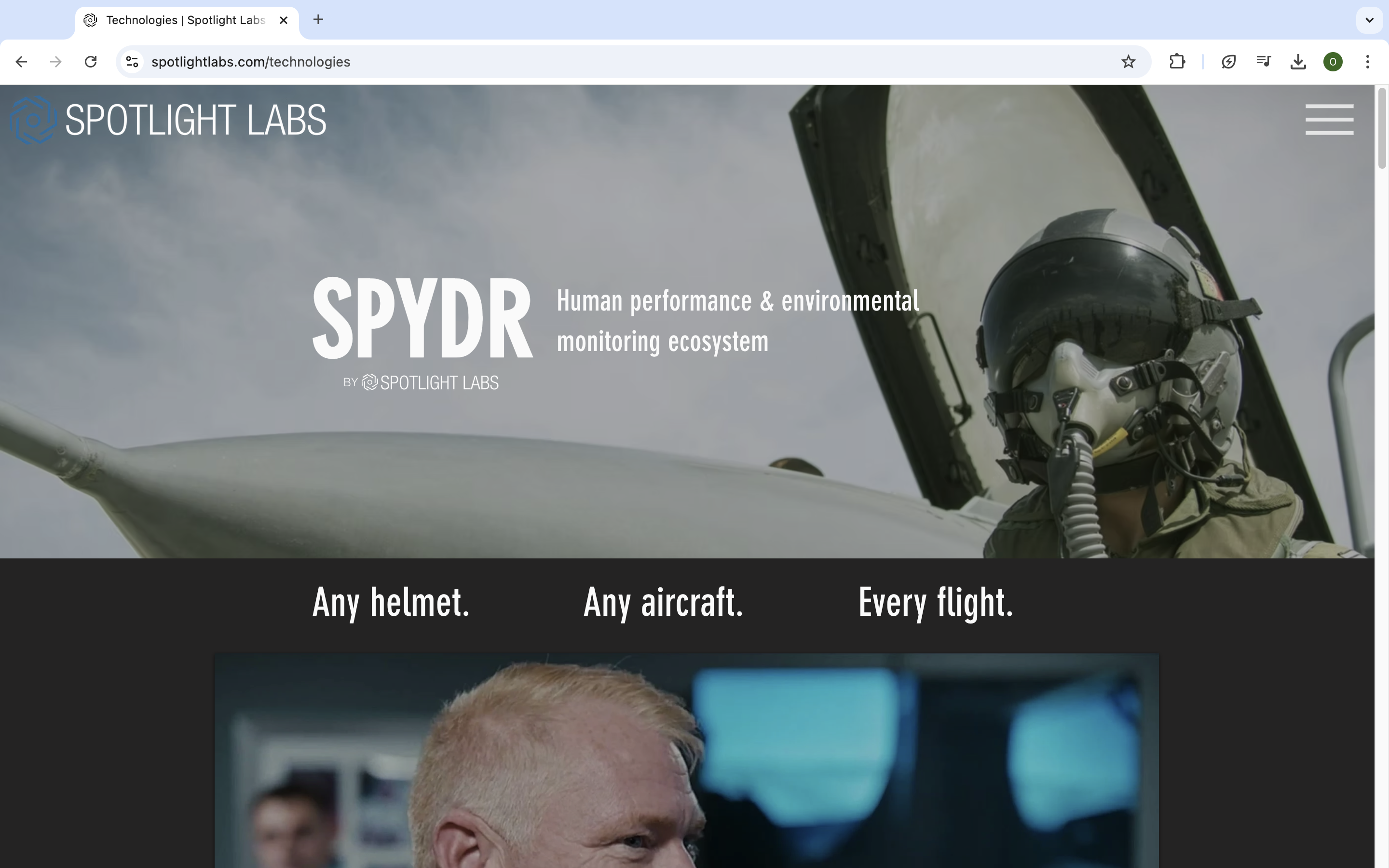
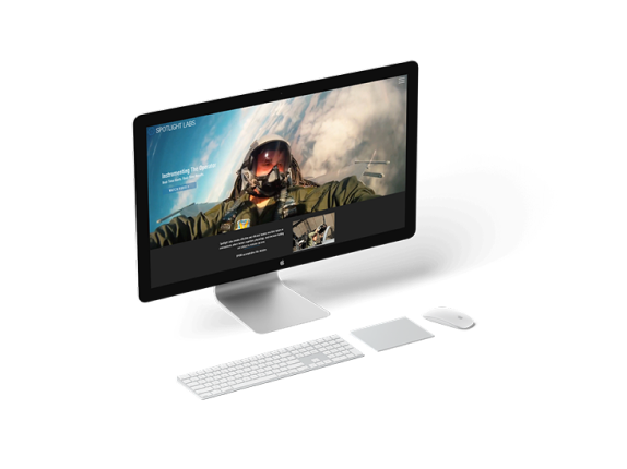
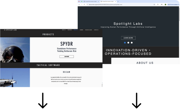
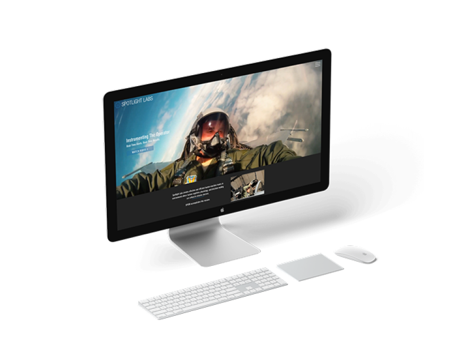
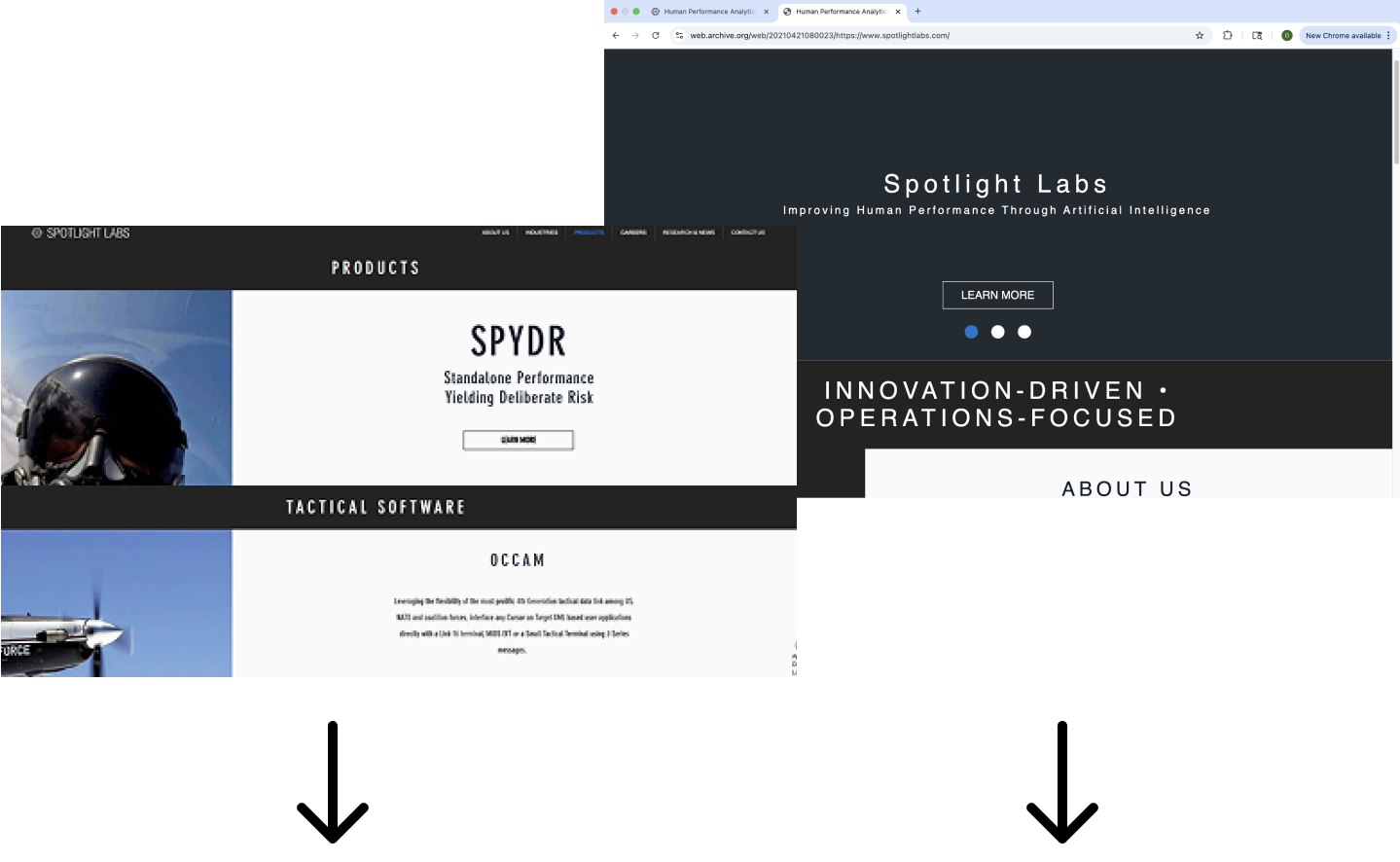
Home page
Because most users visit the site for the product ‘SPYDR’, we put the product video here along with the title and tagline.
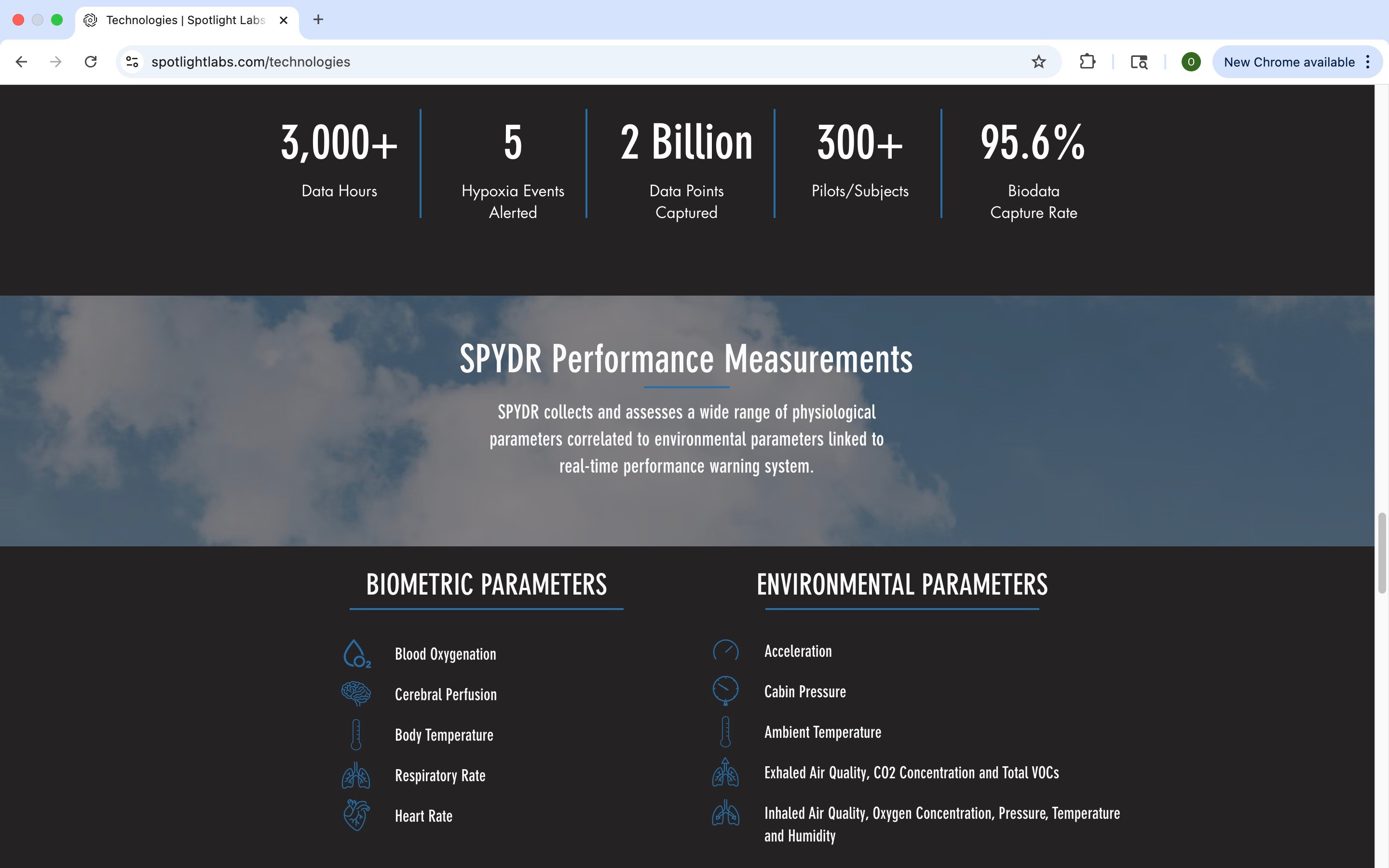
Product page
The product page displays the features with hover interactions to provide extra details and hold the users attention.
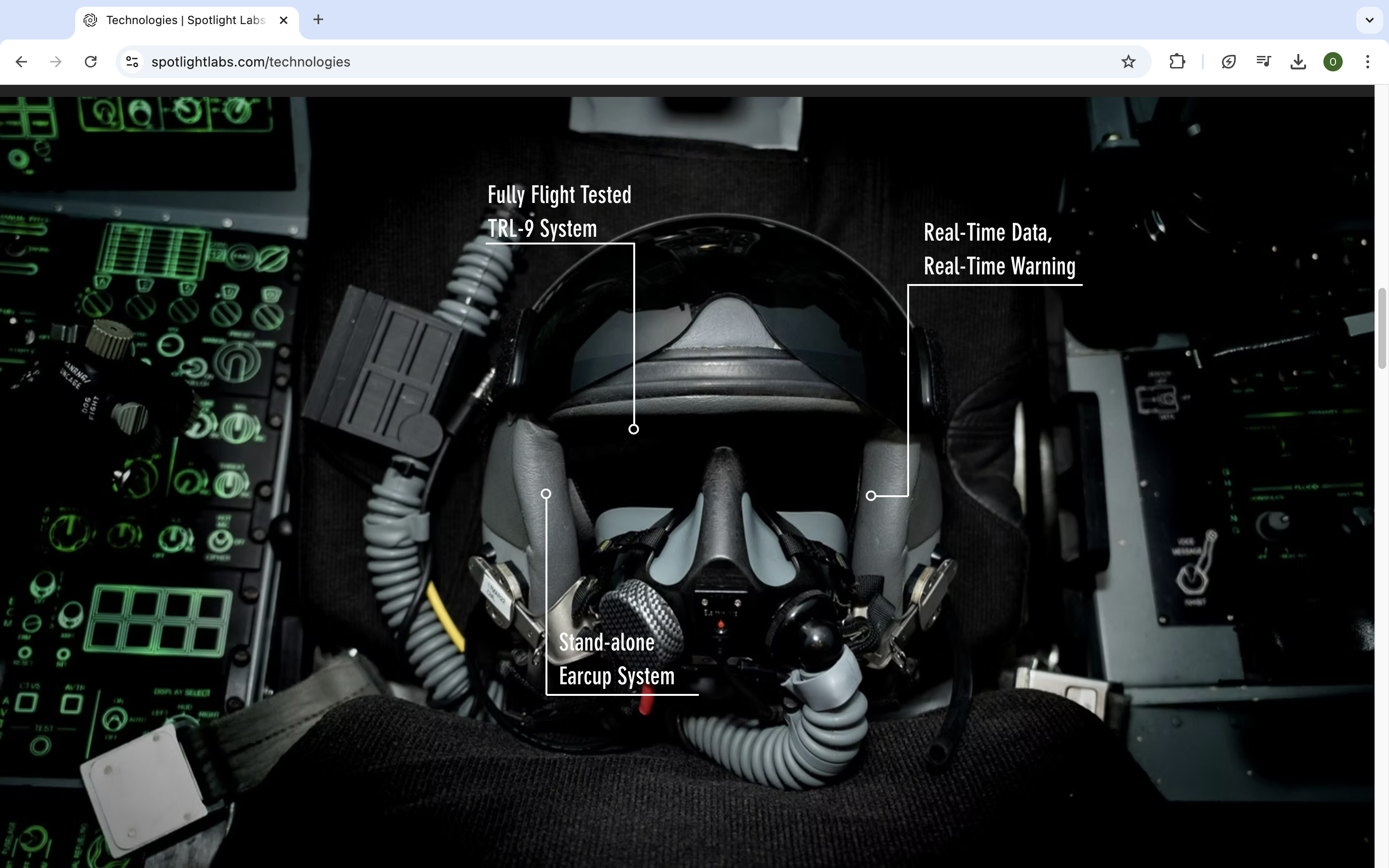
Tech specs
I created illustrations to highlight features and break up blocks of text on the page, creating a more readable experience.
Goals
The main goal was to transform the old site into a destination for customers to obtain clear information on the product while highlighting videos and photos advertising the company.

Increase the volume of site visitors and keep them on the site engaging with content longer.
Clearly communicate details about the product they are selling in order to bring in new clients and increase sales.
Create a successful platform to launch a new brand video, and highlight user testimonials and research showing the benefits of using the product.
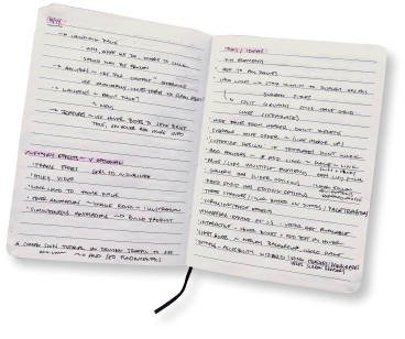
Research and planning
Our team worked together to research existing websites of similar companies and met with the founders to understand our audience. Together we decided on a clean, minimalistic design to highlight the brand new company video on the home page.
Colors

Illustrations

Wireframes and sketches
Collaborating with the marketing team we determined the most information should be on the product page, and that the home page should provide a quick and easy path from the brand video to the product page.
Launch and public responce
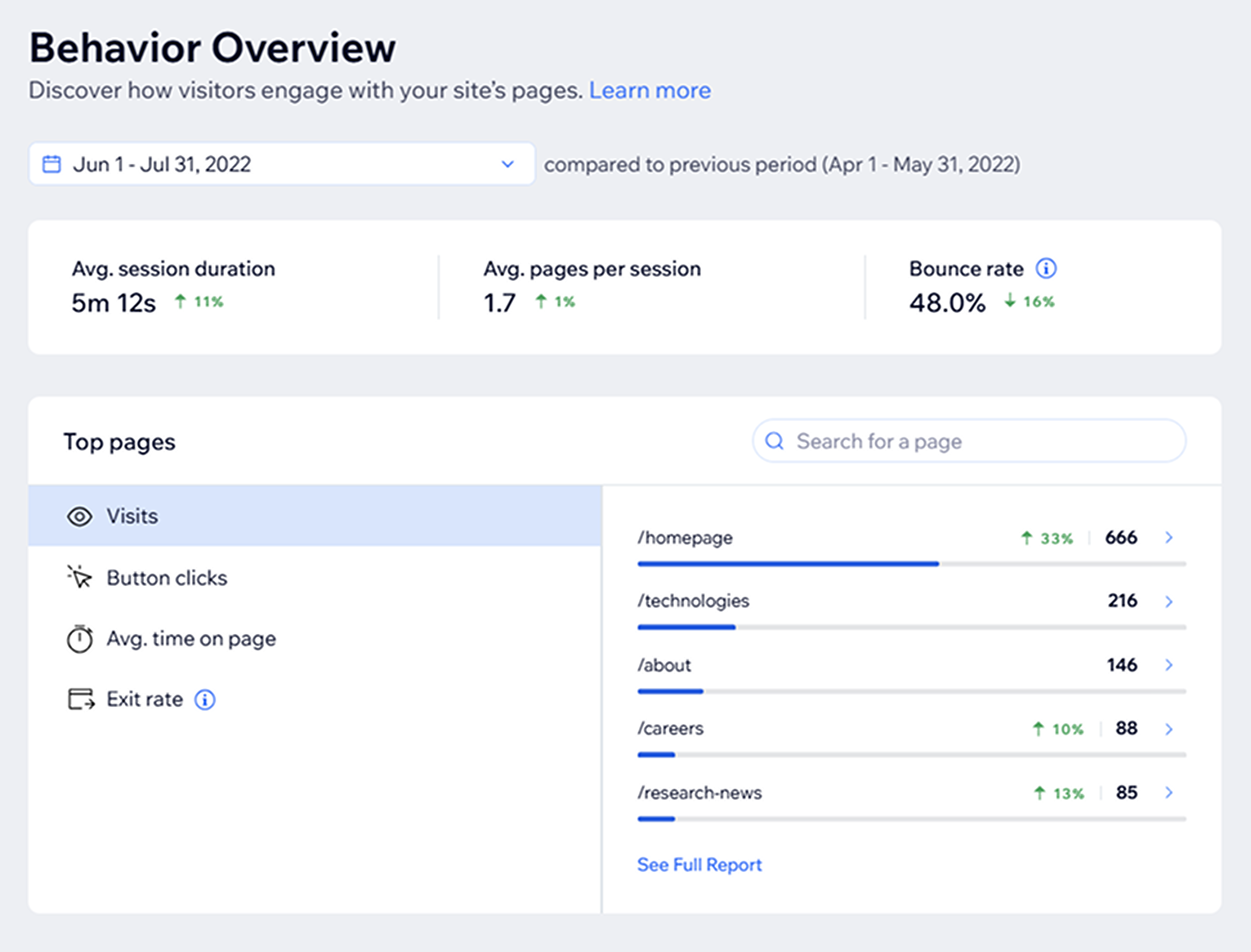
Once our final review was completed with the founders, we launched the new site to the public and shared it across socials. Within the first month we received multiple positive reviews and site traffic increased by over 30%.
What I learned and would do differently next time
Clarity
During this project I worked with a marketing director who was skilled at communicating objectives for every meeting and assigning tasks without overloading anyone. Moving forward to other projects I continue to utilize her meeting templates and management style to complete tasks as a team more efficiently.
Communication
Because we were only able to gain access to the founders input sporadically, I learned to use my time wisely in order to clarify my understanding of every objective. This eliminated the need for me to make assumptions on what the client wanted, and create more informed user personas that aided me in the design process.
Tools
The original site was created with Wix, which I decided to continue using for the redesign. Although this allowed for me to use the framework of the old site, Wix’s developer tools were clunky and lacked features we wanted for forms and menus. Moving forward, I would do more research on the benefits of current products and implement new tools when appropriate.
SpotlightLabs.com website redesign
In preparation for upcoming product launches, Spotlight Labs needed to redesign their existing website in order to increase site traffic and present a cohesive brand image. My role focused on design of the web pages, including user flow, page structure and visuals, as well as development of the final project using Wix.
Role
Website Designer/Developer
Timeline
April - June 2022
Platform
Wix
Collaboration
2 Founders, 1 Marketing Director, 1 Content Writer, 2 Test Users
Home page
Because most users visit the site for the product ‘SPYDR’, we put the product video here along with the title and tagline.
Product page
The product page displays the features with hover interactions to provide extra details and hold the users attention.
Tech specs
I created illustrations to highlight features and break up blocks of text on the page, creating a more readable experience.
Goals
The main goal was to transform the old site into a destination for customers to obtain clear information on the product while highlighting videos and photos advertising the company.
Increase the volume of site visitors and keep them on the site engaging with content longer.
Clearly communicate details about the product they are selling in order to bring in new clients and increase sales.
Create a successful platform to launch a new brand video, and highlight user testimonials and research showing the benefits of using the product.
Research and planning
Our team worked together to research existing websites of similar companies and met with the founders to understand our audience. Together we decided on a clean, minimalistic design to highlight the brand new company video on the home page.
Colors
Illustrations
Wireframes and sketches
Collaborating with the marketing team we determined the most information should be on the product page, and that the home page should provide a quick and easy path from the brand video to the product page.
Launch and public responce
Once our final review was completed with the founders, we launched the new site to the public and shared it across socials. Within the first month we received multiple positive reviews and site traffic increased by over 30%.
What I learned and would do differently next time
Clarity
During this project I worked with a marketing director who was skilled at communicating objectives for every meeting and assigning tasks without overloading anyone. Moving forward to other projects I continue to utilize her meeting templates and management style to complete tasks as a team more efficiently.
Communication
Because we were only able to gain access to the founders input sporadically, I learned to use my time wisely in order to clarify my understanding of every objective. This eliminated the need for me to make assumptions on what the client wanted, and create more informed user personas that aided me in the design process.
Tools
The original site was created with Wix, which I decided to continue using for the redesign. Although this allowed for me to use the framework of the old site, Wix’s developer tools were clunky and lacked features we wanted for forms and menus. Moving forward, I would do more research on the benefits of current products and implement new tools when appropriate.
SpotlightLabs.com website redesign
In preparation for upcoming product launches, Spotlight Labs needed to redesign their existing website in order to increase site traffic and present a cohesive brand image. My role focused on design of the web pages, including user flow, page structure and visuals, as well as development of the final project using Wix.
Role
Website Designer/Developer
Timeline
April - June 2022
Platform
Wix
Collaboration
2 Founders, 1 Marketing Director, 1 Content Writer, 2 Test Users
Home page
Because most users visit the site for the product ‘SPYDR’, we put the product video here along with the title and tagline.
Product page
The product page displays the features with hover interactions to provide extra details and hold the users attention.
Tech specs
I created illustrations to highlight features and break up blocks of text on the page, creating a more readable experience.
Goals
The main goal was to transform the old site into a destination for customers to obtain clear information on the product while highlighting videos and photos advertising the company.
Increase the volume of site visitors and keep them on the site engaging with content longer.
Clearly communicate details about the product they are selling in order to bring in new clients and increase sales.
Create a successful platform to launch a new brand video, and highlight user testimonials and research showing the benefits of using the product.
Research and planning
Our team worked together to research existing websites of similar companies and met with the founders to understand our audience. Together we decided on a clean, minimalistic design to highlight the brand new company video on the home page.
Colors
Illustrations
Wireframes and sketches
Collaborating with the marketing team we determined the most information should be on the product page, and that the home page should provide a quick and easy path from the brand video to the product page.

Launch and public responce
Once our final review was completed with the founders, we launched the new site to the public and shared it across socials. Within the first month we received multiple positive reviews and site traffic increased by over 30%.
What I learned and would do differently next time
Clarity
During this project I worked with a marketing director who was skilled at communicating objectives for every meeting and assigning tasks without overloading anyone. Moving forward to other projects I continue to utilize her meeting templates and management style to complete tasks as a team more efficiently.
Communication
Because we were only able to gain access to the founders input sporadically, I learned to use my time wisely in order to clarify my understanding of every objective. This eliminated the need for me to make assumptions on what the client wanted, and create more informed user personas that aided me in the design process.
Tools
The original site was created with Wix, which I decided to continue using for the redesign. Although this allowed for me to use the framework of the old site, Wix’s developer tools were clunky and lacked features we wanted for forms and menus. Moving forward, I would do more research on the benefits of current products and implement new tools when appropriate.